A couple of posts ago (which on my current blogging schedule was a couple of years ago) I wrote about the value of transitions, and gave examples of some commons ones. The examples were sliding or pushing, vertically or horizontally - essentially rectangles moving on and off the screen. These transitions can cover most use cases and will get you a long way, but as with any other aspect of a design, we should be considering transitions on an individual basis. Transitions can help guide a visitor through an experience, and also be an opportunity to re-enforce the visual identity. With animation being a relatively new feature of web design, and animated page transitions not being natively supported in browsers it's easy to not give them as much consideration as much as other aspects of a design.
Today I’m going to design and build a little app with bespoke transitions that hopefully take into account the particular needs of the design. To do this I will:
- Design some static mock-ups (in Figma).
- Build the app with Vue (Vue gives us a bit of a jump-start with transitions)
- Style the transitions with CSS
Design, let’s go #
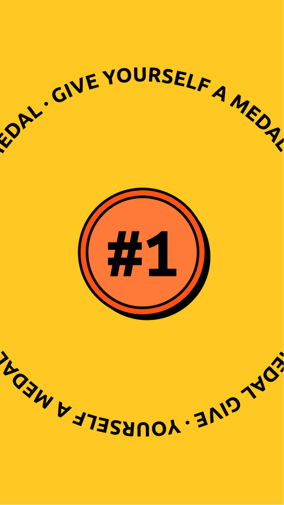
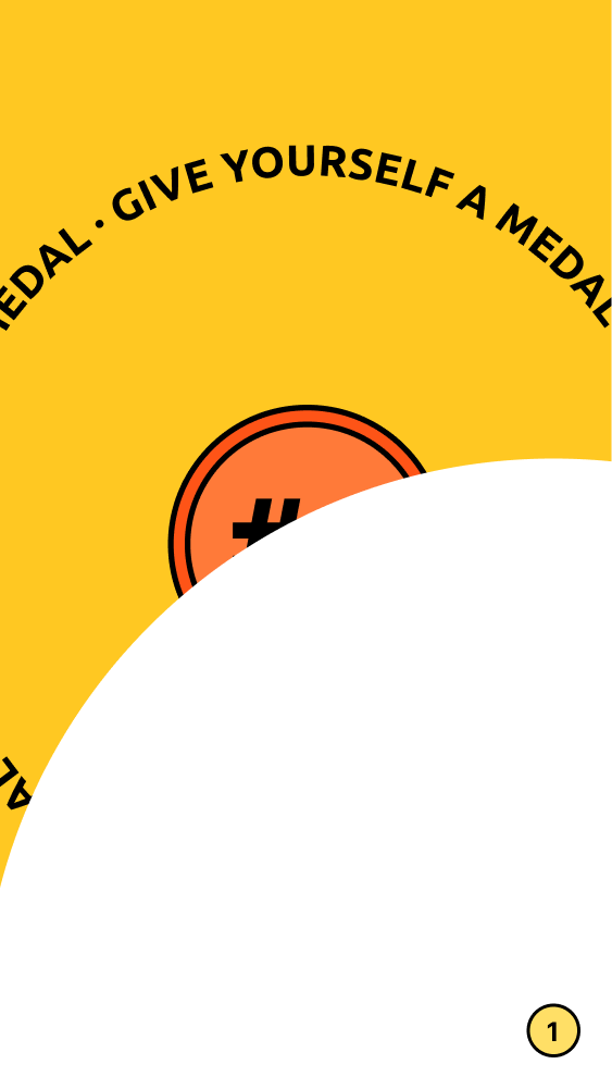
A colleague of mine recently mentioned an idea she had for an app. I’m borrowing it for this exercise. The idea is essentially “Give yourself a medal”. So in my imagined version of this app we’d have:
- A button you can press... to give yourself a medal
- Some sort of gratification where you “receive” your “medal”
- And to give us another screen to work with, a collection where you can see your hard earned medals
I start by designing those three views. Here’s what I’ve got:
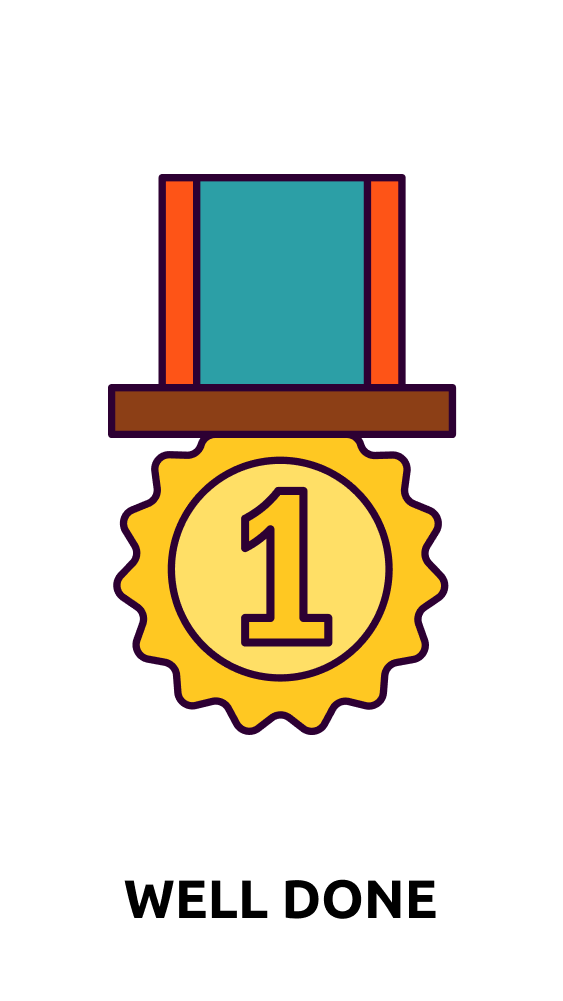
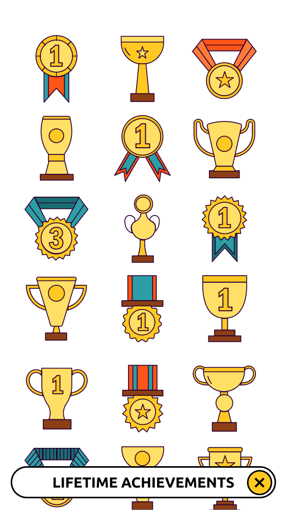
A bit more borrowing here - shout out to GraphicSurf for the medal illustrations.
With those designs signed off (by me) it’s time to think about our transitions. How do we get from the big button (that orange thing with “#1” on it) to the presentation of the medal? I like transitions to be anchored to the thing you are pressing. If I have an off-canvas / burger menu for example, I will usually bring it in from the side of the screen where the menu icon is. Here the button is anchored to the centre of the page, so it feels natural that the animation originate there. With circles being such a strong feature of the design, it also feels natural that they feature in the transitions. So here’s what I’m thinking, a circular wipe from one view to the next.
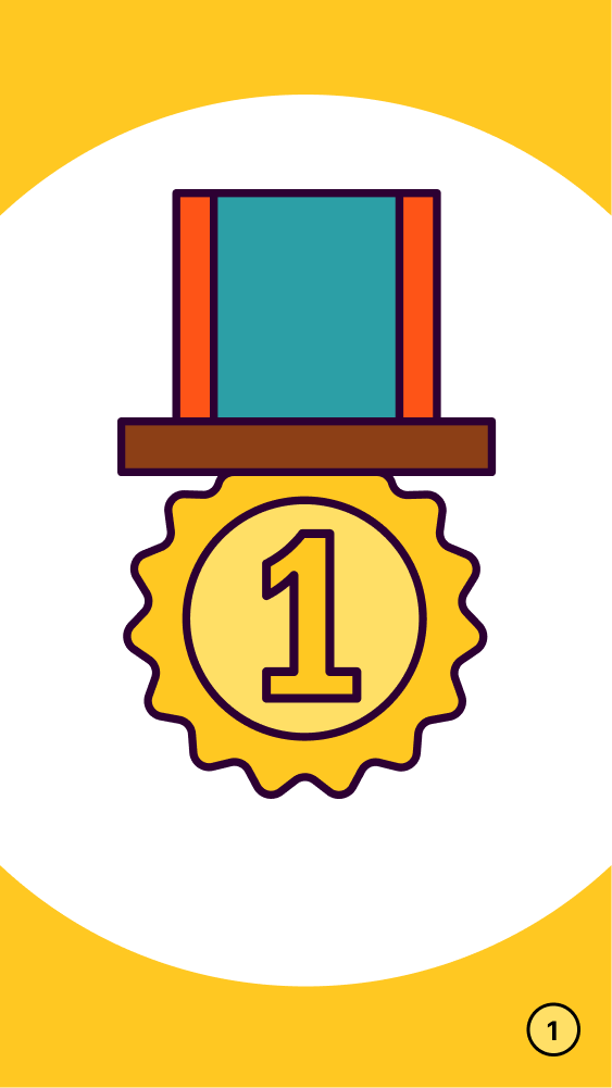
I think that’s all I need in terms of mock-ups for the transition between those two views. My plan here is that after a set period of time this view will automatically close and we will be returned to the start. We could just reverse the animation for that transition, but we can do better than that. You may have noticed that a little number has appeared in the bottom right of the screen at this stage. The intention here is that this will be a counter to tell us how many medals we have. This counter will also act as a button to show all the medals in the collection. To help make clear what is happening here we can make the wipe centre on that counter as it closes. This I think will give the impression of the medal on screen being transported into that corner, drawing attention to the existence of the counter / button.
With our attention on that button, what happens when we press it? Again we want to reinforce what is happening by anchoring the animation to the point where we are interacting, so here we can reuse the previous corner animation to open and close the collection. Done.
Build the app already #
I’m going to build this little app as a single page in Vue. Vue will do the work of hiding and showing our sections, and also add classes before and after a transition. These are the classes that we will attach our styles to in order to build our bespoke transitions. We don’t have native transitions in browsers yet, so Vue is a nice shortcut that will get us to the styling stage really quickly. If you’re not using a framework that does this there are JavaScript libraries that can add those transition classes to regular page transitions. See this post for how to do that using Barba.js.
I’ve made a Vue component for each of the bits that I’ll be transitioning. Here is the first component we want to transition in - the presentation of the new medal.
js
Whether this component is visible depends on the boolean showNew, which is set to true when the big button is pressed, and then back to false a couple of seconds later. The transition magic starts when we add a Vue <transition> component.
js
The transition component adds our enter and leave classes when the visibility is toggled. I’ve given the transition a name - new which will prefix the transition classes. This means we can individually style our multiple transitions (by giving them unique names). From a transition point of view, this is essentially all we need to do in Vue. Repeating for the collection view. You can read more about the transitions classes in the Vue docs.
Finally, some style #
Just two CSS tasks to do now; create the animations and apply them to our transition classes. That’s going to look something like this:
css
css
css
And that’s about all it takes to get a couple of nice, bespoke transitions going. Nailed it. Give yourself a medal!