Early 2019 was a simpler time, when most of us had a bit more bandwidth to think about the finer details of web design. Back then I was banging on about contextual styling; I'd like to revisit this today, this time through the lens of the :has() pseudo-class.
Context in CSS #
When I talk about context in CSS I'm thinking about these sorts of things:
- Descendants
- Children
- Siblings
- Browser size / shape
- User preferences
The last two on that list are very explicitly addressed with media queries. We have some tools to create styles based on the others, such as child and sibling selectors, but there are limitations. Sibling combinators are limited to elements that follow the target element in the DOM, either immediately (+) or not necessarily immediately (~). Then there's the lack of a parent selector, until now… well, soon.
:has #
Note that at the time of writing, :has() is only supported in Safari 15.4 and behind a flag in Chrome.
The :has() pseudo-class can be a sort of a parent selector, but where you write your styles on the parent, based on what children it has. For example if you wanted to style links differently if they contain images you could do this:
css
Using our existing CSS tools we can get more specific. Let's say we want to style our link differently if its only direct child is an image. We can do that:
css
We shouldn't think about :has() as "a sort of parent selector" though, it's better than that. Let's take the problem of only being able to target siblings that are later in the DOM. For example, we want to style .banner differently if it is immediately followed by .footer. We can't do that with sibling combinators alone; we can do that with the addition of :has():
css
Let's build something #
All sounds very cool in theory, let's put it into practice. I've come up with another couple of simple use-cases and a little project to use as a vehicle for them. Use-cases are:
- Hover over a link and its parent styling changes - effectively a hover-within
- Style an element based on the state of a web component within it.
To try these ideas out I'm going to build a little dashboard that lists my side projects and displays their lighthouse scores alongside them. I'll build this on top of Speedlify by Zach Leatherman, which will give me the speedlify-score web component.
Here's my design:
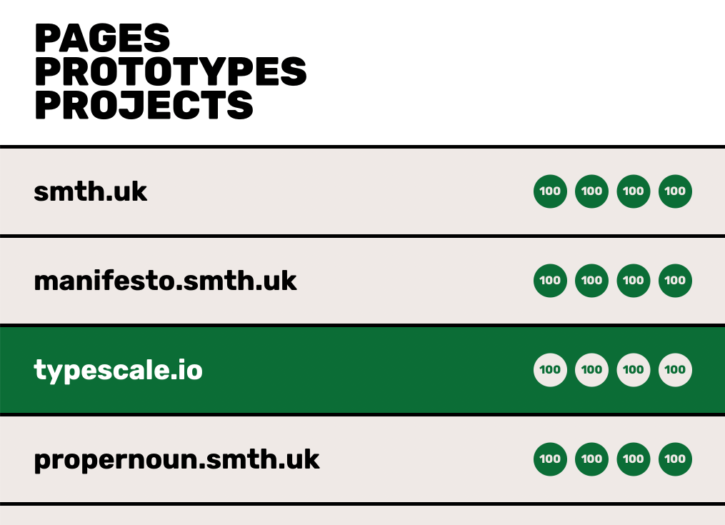
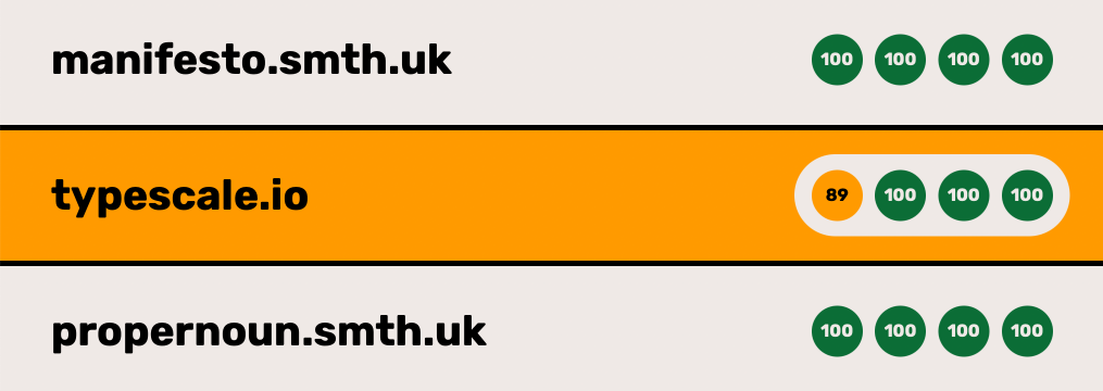
The green row represents what will happen when you hover the URL. The plan is that the highlight colour will be dependant on the scores to the right. So if the lowest score is in the "Needs Improvement" range (50 to 89) it will be orange, and likewise if it's in the "Poor" range it will be red.
With the basic design styled, let's use :has() to get the hover working. In the SCSS for the list item, I have some custom properties controlling the colours. I simply reassign these when .site-list_item has a hover:
scss
Worth noting that if you were giving focus-within the same style, you might be tempted to comma separate the two like this:
scss
This whole block would be ignored in browsers that do not support :has(), so you should write them as separate declarations:
scss
On to our second challenge - changing the accent colour dependant on the scores. The speedlify-score component has a class on each score to colour code the score circles. A "Good" score will look like this:
html
While a "Bad" score will look like this:
html
We can use the existence of these classes to update our custom properties, like so:
scss
Here we are using green by default, then if there's an "OK" (Needs Improvement) score we switch to orange and/or if theres a "Bad" score we switch to red.
That's it, both the objectives met with a few lines of very neat CSS. You can see the end result here, but I couldn't find a project with less than "Good" scores I'm afraid 😎 Both of these design challenges could be achieved without :has() with perhaps some convoluted CSS or more likely Javascript, but I like how robust and easy to comprehend this feels. Of course I'm only scratching the surface here; I'm excited to see what possibilities the :has() pseudo-class opens up.