In my recent writing on how I think CSS is best written, a core tenet of my methods has been keeping presentational information out of markup. Essentially, the reason for this preference is that it makes restyling problematic, including dynamic restyling, in response to screen size. In contemporary practice, the epitome of presentational information in markup is perhaps the "utility class". A utility or helper class in CSS typically applies a single rule to an element, though it can include a set of rules to achieve one simple objective. Here are a couple examples from the "utility first" framework Tailwind:
css
css
These obviously embrace the idea of styling information in HTML, and so, in an ideal world, not a strategy I would adopt. This approach can be appealing though, for at least a couple of reasons. One big reason is that utility classes can serve to minimise the amount of time you spend writing CSS. If using a framework such as Tailwind, this time could be reduced to zero. Attractive if you don't like writing CSS, but personally, I'm not sure that not liking CSS is a valid justification for this compromise. That's not to say however that I don't see value in utility classes.
The case for utility classes #
Let's look at an example page - the Bootstrap example pricing page.
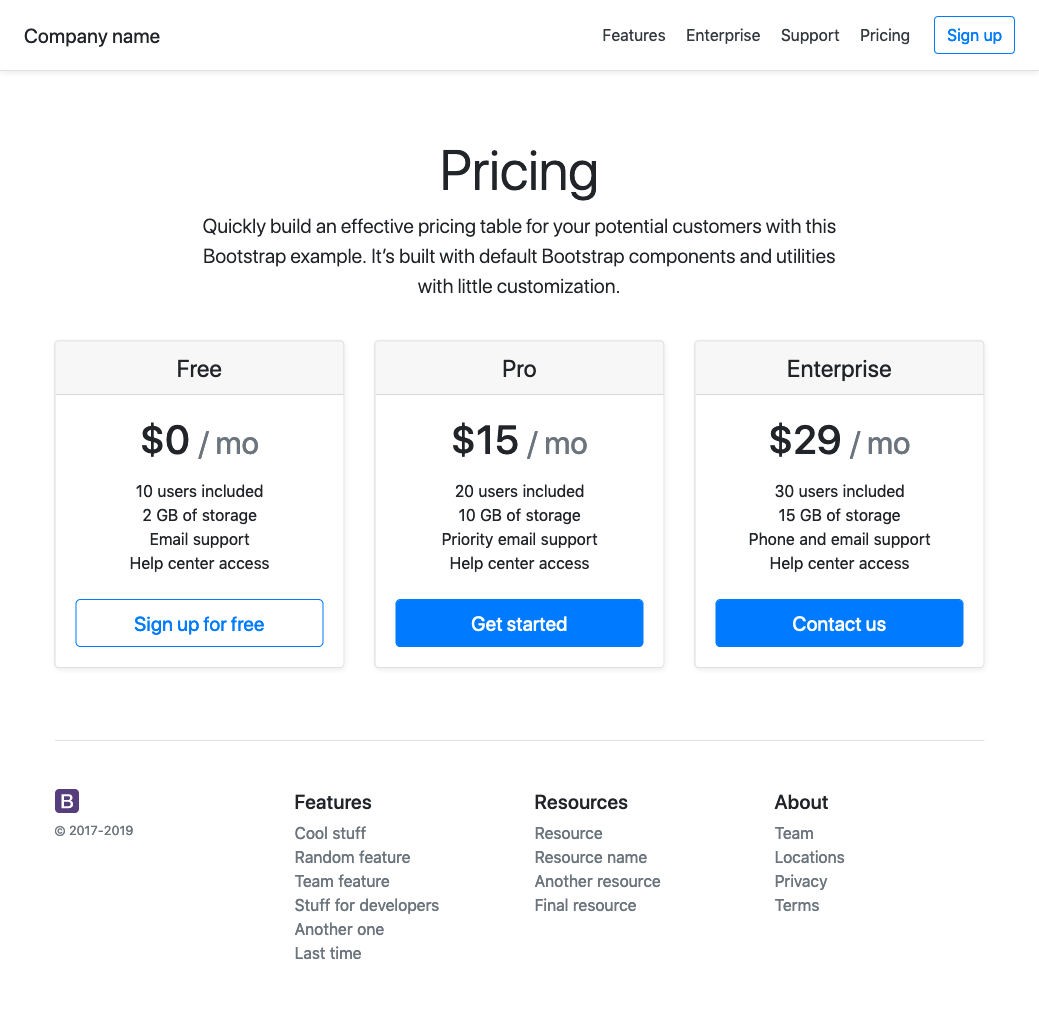
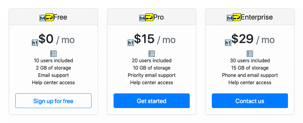
Each "card", representing a price point, contains two text elements that are deemed to be key pieces of information, and so are treated to larger font sizes. The card title get's its font size by way of being an h4. This problematic; in the hierarchy of the page, those should be h2. Things get worse when you realise that the price get's it's large font size by way of the h1 tag. This is now very clearly not semantic structure.
If you are unsure as to why this is problematic, you are probably only considering the perspective of someone experiencing the page purely visually. As is explained by the accessibility evaluation tool, WAVE, document structure facilitates navigation by users of assistive technologies. For these assistive technologies to work in a meaningful way, they need to understand the page. A meaningful content structure is part of what makes this possible.
So how could the Bootstrap pricing example have been better achieved? One way would be to create some context specific selectors, something like (keeping with the slightly abstract naming convention) card-title and card-callout, and attach the desired styling to those classes. This would allow the structure to be corrected, and in most cases would probably be a decent solution. This was the approach I started to take in my own framework, but quickly came to the conclusion, that this approach is too limiting for a framework. The options are limited to those imagined and cantered for by the author of the framework. A better approach, I feel, is to consider the wider challenge - in this case the desire to use different font sizes for different scenarios. This is where utility classes come in. Having utility classes text-large and text-extra-large would solve the same problem, but in a more versatile way. The title could be larger than the call-out, for example. We are now of course back in the possibly undesirable world of presentationaly named classes. In the context of a framework though, with versatility being so desirable, this compromise feels a little more reasonable. There is another issue in this scenario though. With a mix of components and a utility classes, styling information is being scattered around in a manner that might be difficult for someone working with the code to keep track of and reason about.
A possible alternative #
When facing the above challenge, my second approach was indeed the utility class, but with a little shift in thinking, it became something else. The author of the above Bootstrap example was (ill-advisedly) leveraging the heading hierarchy to achieve the visual appearance. The h1 element in Bootstrap (and typically on the Web) is styled to have a large font size, and the heading sizes decrease through the heading levels, down to h6. Modern web pages / apps are more complex than simply headings and paragraphs, that's why we end up with component libraries and CSS frameworks. It struck me that a useful part of such a framework might be a visual text hierarchy. So similar to an h1, you would have .text1, which would in some way be more visually prominent than .text2. Although the styles attached to one of these classes might be the same as you'd find attached to a utility class, there are significant differences here. .text1 is not strictly about font size, it's a hook for some possible styling. This styling might be a large font size, but in another context, a smaller screen for example, it might not be. I think it would be more accurate to consider this a component (albeit a very small one), rather than a utility.
For this use-case, I think text hierarchy components are a good alternative to font size utility classes. It remains to be tested whether semantically named micro-components could be useful alternatives to utility classes more broadly.