It was 2004; Myspace was the hot social media platform, Lost was the TV show everyone was talking about, and the UK Government was mailing out a booklet called "Preparing for Emergencies". This was a twenty-odd page, A5 (landscape) booklet, with an incongruent visual identity. It contained some reassurances and advice for what to do in a some broad categories of future emergency. It felt silly at the time but in hindsight it feels like a bit of a dream to have a government that takes potential threats to its citizens seriously. Anyway, it was very easy to make fun of, and I needed little excuse back then to make fun of the government or to make a new website. So "Preparing for Zombies" was born. Before you click that, two disclaimers: 1) It's dumb, don't bother reading it. 2) that's not, strictly speaking, the website I made in 2004.
The Preparing for Zombies site had been offline for a while, I would occasionally think "I should put that live somewhere". When it occurred to me that the site was twenty years old it felt like an opportunity to do something a little more interesting. So I decided to rebuild the site, using 2024 tools and practices, and document what I do differently. The brief I gave myself was to recreate the original website, making changes only when I saw opportunities for improvement, afforded by modern practices. The copy would remain as it was. The spirit of the design would remain, but would inevitably be shaped by the radically different devices we now use to consume websites.
Tooling #
We don't do much these days before thinking about what tools we are going to use, so that seems like a good place to start. This being a static site, there's not really any need for a "backend" - a database or server side language. That was true in 2004 as it is now, but one reason I might have opted for a language like PHP would have been includes. Ever since we stopped using <frameset> to layout web pages we have been faced with the question of how to do includes. For example, navigation that needs to appear on every page. It appears my 2004 solution to this was Dreamweaver.
In 2004 Dreamweaver was an integrated development environment (IDE) developed by Macromedia. The following year Macromedia was acquired by Adobe, who still sells Dreamweaver today; though I have no idea how the software has changed. Back in 2004 at least, Dreamweaver attempted to offer WYSIWYG capabilities, writing code for you. It wrote notoriously bad code, and the very idea of machines writing HTML was widely ridiculed for years to come. Today though, with tools like Figma Dev Mode, and Microsoft's Copilot that idea seems to be back in favour (hopefully with some lessons having been learnt). I don't think I let Dreamweaver write my code in 2004, but it did give me HTML includes. I only had the compiled HTML (.htm files!), but in there were comments like <!-- #BeginLibraryItem "/Library/menu.lbi" -->. I don't really remember this Library Item feature, but apparently it's still a thing. Today my solution is to use some sort of templating language, usually something like Nunjucks, or other Mustache-like language. The build step is not carried out by my code editor (VS Code) in 2024; in this case I have used Astro, the current hotness in static site generation.
Semantic HTML #
While it's easy to criticise Dreamweaver for writing bad code, us humans can be guilty of it too. This rebuild is not the second, but third iteration of the Preparing for Zombies website. The second iteration would have been made a couple of years after the first, when floats were added to CSS. Floats were the first tool in CSS to allow us to do anything resembling layout; in 2004 standard practice for controlling layout was to put everything inside <table>s. As much as I'd like to pretend that second iteration was the only one, if we're talking 2004 I have to acknowledge the table layout.
Related to HTML semantics is the introduction of ARIA. ARIA can be useful when you start to roll your own non-standard bits of interface, such as in this case where I've progressively enhanced the main navigation to behave like a modal.
Javascript #
As I've touched upon it let's talk a little about Javascript (JS). JS has moved relatively quickly over the past twenty year, but Preparing for Zombies being a content focused site there was no JS in the original. One take would be that the 2024 iteration should be stuffed with JS. I haven't done that. I think it would be fair to consider it a downgrade if the new site required Javascript to do what the old one did without it. As mentioned though I have added a few bits of JS to smooth out the some experiences. The aforementioned navigation modal has JS to manage focus, moving it and making parts of the page inert to trap it. There's also Astro's implementation of View Transitions, which were useful to make the audio player persist (keep playing) across page loads. That audio player also has custom controls, requiring Javascript. What's interesting here from a "what's new?" point of view is the use of Web Components, or more specifically custom elements. I made three custom elements as part of this rebuild: <audio-player>, <contents-modal>, and <open-menu> (my naming could have been better here, "contents" and "menu" referring to the same thing). Web Components are not giving me any new functionality, but I find them to be a nice design pattern for creating discrete bits of interface like these. To give an example of what one of these components does, <open-menu> takes the <a> that's inside it, converts it to a <button>, and adds an event listener to it.
Small screens #
Perhaps the most obvious change to the frontend of websites is the range of devices we use to visit them. The 2004 site didn't care much about the size of your screen. We didn't have smart phones then, assumed everyone's screen was more or less the same size, and picked a number of pixels that we were fairly confident would fit on everyones screen. Responsive web design (RWD) is now ubiquitous, but Ethan Marcotte wouldn't coin that term for another six years. The 2024 iteration obviously needed to be brought up to date in this respect. Almost all the visual changes I made derive from the idea of design responding to the characteristics of the device. From the use of relative units instead of absolute, to putting the navigation in an off-canvas menu. One of the first tools we had for responsive web pages was media queries, they were almost synonymous with RWD. While those remain in heavy use today, and indeed have been introduced to this rebuild, they can be a blunt tool, and are becoming less and less the answer to the responsive question. The CSS layout properties that have followed float have been designed with adapting to screen size in mind. In 2024 I'm spoilt for choice, making use of CSS columns, viewport units, min() and max() functions, flex, grid. Whether we call this responsive or intrinsic web design, all of these techniques are working together to adapt to the available space. In this case I mostly took the approach of scaling everything with the viewport, which feels like a spiritual successor to the fixed layouts of twenty years ago.
CSS #
So how different was the CSS? One thing that jumps out when looking at the old CSS is the browser hacks. Thankfully we find ourselves in a good spot in 2024, where we don't have to concern ourselves with browser specific CSS. In my 2004 CSS however there were a few hacks, some targeting IE generally some targeting specific versions IE 5 and IE 6. Aside from the weird syntax used in the hacks, the old CSS looks very recognisable as CSS you'd see today. I would say that the specificity is a little all over the place for my current taste. Sometimes targeting elements, sometimes classes, sometimes IDs. For this little dumb site, that wouldn't matter, but for my 2024 iteration I'm following my C3CSS methodology. Even that feels dated in 2024, such methodologies become much less useful with the introduction of @scope. Amongst the biggest changes would be those I just mentioned, the responsive layout stuff, but those are certainly not the only game changers.
Another change that had big impact on how websites look was the rise of @font-face. This rule had been around for a long time, but wasn't typically used in 2004 due to amongst other things it not being supported by FireFox. In 2004 the choice of typefaces was really limited to so called "web safe fonts" - fonts thought to be universally installed across all devices. I think at the time those were widely considered to be:
- Arial (sans-serif)
- Verdana (sans-serif)
- Tahoma (sans-serif)
- Trebuchet (sans-serif)
- Times New Roman (serif)
- Georgia (serif)
- Garamond (serif)
Images aside, these were considered the de facto choices for web design. The 2004 Preparing for Zombies used Verdana throughout. You could argue there was no reason to change that for this rebuild, but I would counter that being deliberate about typography is fundamental to web design in 2024. That being said, I have replaced Verdana with everyones goto font Poppins. In my defence I don't think I've ever used this typeface in a design before, so I'm clinging on to my assertion that this is a deliberate design choice (I feel it has similar characteristics to the wider visual language, in particular it's very circular forms relate well to the circles that appear throughout the design).
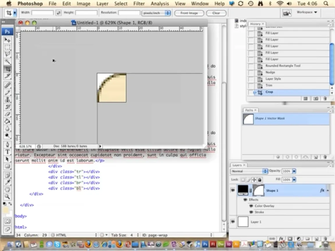
A CSS property that has been added since 2004 and made a big difference to this rebuild was the humble border-radius. We got this in FireFox a couple of years after the first build, and it wasn't supported by IE until IE9 in 2011. There are a lot of rounded corners in this design, they all needed to be images in 2004. The quote portraits have gone from being pre-rounded in Photoshop, with border baked in, to a simple square headshot with CSS border. Where border-radius really became a hero though was the rounded corner box, such as these call-out boxes. Each of those corners was a separate image, a technique typical of the time.
So much has changed in CSS in the last twenty year, but I'll just mention two more additions. First, the ::before and ::after pseudo-elements. Similar to the introduction of floats, these pseudo-elements felt like a turning point, away from the hacky ways of the past, towards a future were we might be able to have HTML based on the content and have control over the design at the same time. In this case I've used them (in combination with border-radius) to do a task that now seems trivial, styling list markers. This very simple example demonstrates how far we've come. In 2004 a list item with a custom marker meant putting the text and an image in table cells. And lastly, I couldn't talk about CSS developments without mentioning perhaps my favourite, the much more recent :has(). I've talked about some more interesting examples in the past, but in this rebuild I used the :has() selector for one small enhancement, to control what happens to items in an accordion, when one of them is opened (spoiler: they just disappear).
Audio / video #
As you may have seen, the accordion I just mentioned contains videos. The original site didn't have videos. Not only did we not have the <video> element that makes this possible, we didn't even have Youtube in 2004. That's why it didn't feel strange that instead of videos you could play, this section of the original site contained links to somewhere you could buy physical copies of the films. Similarly, in 2004 the site had another page with links to zombie themed music you could buy from iTunes. In the age of music streaming that would feel weird, so I replaced that page with an <audio> player, added to the site navigation. The addition of the <audio> and <video> elements to HTML makes adding this media simple, though when you want to customise the UI you are somewhat on your own.
Images #
There is another form of media we need to discuss - images. All the images in the original build were GIFs. JPGs and PNGs I think were more typical though. I'm not sure if it was my knowledge or the available tools that were lacking in 2004, but at least with the the tools I was using GIFs sometimes had an advantage over JPGs and PNGs, they could have transparent backgrounds (sort of) while having a reasonably small file size. I would have been using Photoshop back then, and exporting transparent PNGs with it's "Save for web" feature could result in huge files. It wasn't until later that I learned of pngquant and the tools built on it, including a Photoshop plugin and standalone applications. These tools allowed us to get PNGs down to sizes suitable for web use, and relieved me of my relationship with GIFs. We were also not using SVG in 2004. While SVG existed, and was in the web spec, I don't think it was in any browsers, certainly not Internet Explorer. The landscape has shifted quite a bit in the last twenty years. In this update I have used SVG for some graphical elements, such as the logo. For the raster images we now of course have better options, such as WebP and more recently AVIF. Swapping the images out for WebP has meant that they can be higher resolution and transparent where required without becoming prohibitively large in file size. It's worth noting that the largest of these new images (up to 180kb) are still much heavier than I would have contemplated using in 2004, but higher resolution screens and improvements in bandwidth have raised the bar.
Generative AI #
This feels like I'm about to introduce myself at group therapy.. I used generative AI in the production of the raster images. I'm no fan of the current wave of AI. There are obvious concerns in terms of plagiarism, carbon footprint, and in the case of text generation e.g ChatGPT, an alarming tendency to treat the output as a source of truth or knowledge. That combined with "AI" being stuffed into every piece of software for apparently no reason other than hype has turned me off ChatGPT before even trying it. Image generation on the other hand has retained my interest. I think that's probably largely because I see these tools as potential creative aids (generating works of fiction), and my creative practice is all visual. So a tool that helps produce an illustration is going to be more appealing to me than a tool that writes stories. While being far from sure about how I felt about this technology, this project felt like an opportunity to try it in earnest. It certainly felt like the 2024 thing to do. All the zombie images were generated using Stable Diffusion. I installed and ran this locally, so according to my energy provider the electricity used came from renewable sources. My experience of working with this process was hit and miss. I found that I would get a lot of pretty rubbish looking images then the occasional exceptionally impressive image would materialise. Or at least one part of an image being exceptionally impressive. Curiously, I noticed that if you gather the exceptional images together they would often look very similar to each other, to the extent that you can recognise reoccurring details and even faces. These are just anecdotal findings of course, but an obvious interpretation here is that these rare few quality images are the result of the tool producing on those occasions something very close to an image the software was trained on. Or to put it another way, ripping off someone's work. This is a key question for me, "can these tools reproduce (rip off) an image from the training data?". Others have done more rigorous testing in this area. In the paper Diffusion Art or Digital Forgery? Investigating Data Replication in Diffusion Models the authors observed that when using small training datasets most generated images were "extremely similar to the training data", and as training data is increased unique variations are introduced. This suggests to me that reproducing training images is a part of how these tools work. The paper concludes that even with large training datasets "copies do appear to occur often enough that their presence cannot be safely ignored". These findings correlate at least with my hypothesis that the best images are ripping off the work of others, rather than being informed by them. This gets to the heart of my concerns. Humans creating art will look at other work, they might try to emulate it, they might "borrow" (copy) bits of it. This is how we humans learn. I think that is uncontroversial. In principle I feel the same about machines, but there is a line between learning from others work, and stealing it. This is a blurry line, but it's one we comprehend pretty well. We have copyright laws, and laws against forgery. Key to navigating all this is the artists knowledge of how original or otherwise their work is. That knowledge is very much missing from this process. I also found the amount of visual control I had to be lacking, relying quite heavily on trial and error. Though I was able to develop some methods that got me pretty close to the concept I had. Aesthetically I was pretty pleased with the results, after some not insignificant manual editing.
Testing #
We should talk a little about web browsers. Firefox may have just been released when I made Preparing for Zombies. Safari was introduced the year before. Mostly we were concerned with Internet Explorer. In 2024 there are many more browsers, but at the same time much less divergence in how they render our code. That's in part because although there are many browsers in use they are almost all powered by one of three browser engines. More importantly though is the adherence of those browsers to Web Standards, achieved thanks to the Web Standards Project. The work of that group, which started around 1998, got us from the bad old days of browser hacks, to Microsoft releasing a relatively standards compliant browser in 2009 (IE8).
We didn't have Google Lighthouse in 2004, the earliest commit on the GitHub repository is eight years ago. I'm not sure what the closest thing we had back then was, maybe an HTML validator. We certainly didn't have such tools in the browser. The first step towards the DevTools we take for granted today would be taken in around 2005/2006 when the Firefox extension FireBug arrived 🙏. It's perhaps a little unfair to run a twenty year old website through Lighthouse, but for the sake of science I'll do it. Running the 2004 website in a local server and testing with Lighthouse in the browser, it gets:
- Performance
- 100
- Accessibility
- 86
- Best practices
- 89
- SEO
- 100
So what does past me get get marked down on? There are two items under accessibility:
- "
<html>element does not have a[lang]attribute" - "Heading elements are not in a sequentially-descending order"
I don't think there's much insight to derive from that, other than I made a couple of (hefty) rookie errors. Under best practices there are three items:
- "Serves images with low resolution"
- "No
<meta name="viewport">tag found" - "Document contains a
doctypethat triggerslimited-quirks-mode".
These feel much more a reflection of the time. The first is because the images are too small for the high pixel density displays of today. The viewport meta tag was an HTML5 addition, circa 2008. This was needed to ease the transition from fixed width to responsive pages. Now we are at the other side of that transition, not including the viewport meta tag is understandably considered bad practice. The doctype is something I never think about these day, but around the time of the first build there was a decision to make about what doctype to use. As it happens, for reasons I don't recall, the doctype I used here was "HTML 4.01 Transitional". This meant it was somewhere between Quirks Mode and Standards Mode, aka limited-quirks-mode. The best practice Lighthouse is recommending here is specifying a doctype that prevents any sort of quirks mode.
As for the 2024 rebuild, as you might hope it gets 100s across the board.
- Performance
- 100
- Accessibility
- 100
- Best practices
- 100
- SEO
- 100
