I started imagining a different kind of CSS framework, one where multiple isolated components could be created from a base template. These components would be highly configurable, so that sibling components could differ in appearance. This got me thinking about what a component should look like, if it is intended to be customised. Probably the customisations with the biggest impact are going to be changes to colours. Leaning on colour in the base / default components then could be kicking some problems down the road, for the user to deal with. Having to unravel meaning wrapped up in colours, then translate that meaning into the visual language of a brand can be tricky. For example, if the framework relies on two shades of a colour, but the visual identity to be applied only uses bold colours, then either the visual identity has to change, or some meaning will be lost.
Let's take these three Bootstrap components:
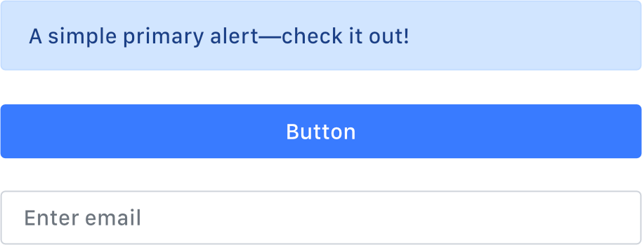
There are a few characteristics that distinguish one from another. It should be noted that context helps with this, and is missing here. I would suggest though that the most significant distinguishing feature is colour. It's easy to imagine a customised version of the above looking like this:
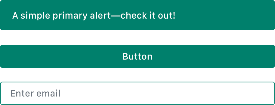
or this:
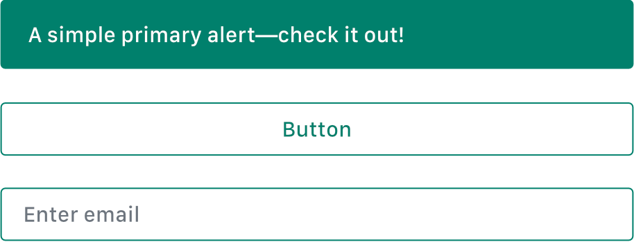
or even this:
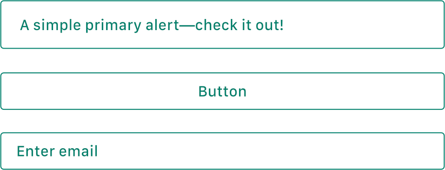
You would be correct to say that these would be bad design choices, and not the fault of the framework. I think it would be equally correct however to say that the framework is not providing much support here. When it comes to making components identifiable, it is offering little more than a colour palette. If designing a framework to be customised, you have to assume that the palette is going to be thrown out. So perhaps the ideal colour palette would include no colours - be black and white.
This would make a lot of sense to me, as a starting point. If I'm designing a logo, I don't jump right in with colour, I focus first on getting it to work in single colour. I started working in this way a long time ago, when logos were designed to be printed, and printing in single colour was cheaper. Thanks to the Web, and to digital printing, having a single colour logo is perhaps less crucial than it used to be. But even if I could guarantee that a single colour version of a logo was never going to be needed, I would still work in this way. I find that designing in black and white helps create a solid foundation to build upon. In a similar way, I believe a single colour component library could make the best base for a bespoke user interface.
Another potential advantage of a single colour component library would be that, "out of the box" it would behave more like a wireframe. That is to say that before customisation, it could be used to plan layout and content, without the distraction of look and feel. I like to use Balsamiq for wireframes, for this reason; the obviously unfinished aesthetic forces everyone involved to focus on content and layout. Having a CSS framework that you can use to create wireframes, then evolve into a finished product feels like an attractive proposition to me, but one I haven't seen realised.
So what would be required to design components that do not rely on colour? I think just like with a logo, it would be designing something with a recognisable form. For some components, this work has been done. The more established web components are recognisable. A solid rectangle with label in the centre of it = a button.. or is it a "badge". The challenge here then is to create a collection of design patterns that can retain meaning, while being flexible enough to absorb a visual identity. Here are some examples that I have been working on:
